Wednesday, May 9, 2012
Digital Imaging Final (Explanation)
The posts for the final on this blog can be observed by following from top to bottom.
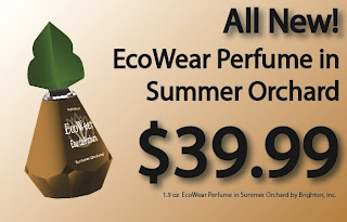
My final project was a mock-version of a company I created called Brighton, Inc. Brighton is a modern and eco-friendly company that sale skin care products, fragrances, makeup, and more. All of their packaging and product vessels are made from 90% recyclable materials whereas the actual products are 80-100% all natural in composition.
I wanted to make a realistic company with realistic products that I could easily see on shelves in stores everywhere. Being that the Green movement is so popular at this time, I thought that developing a company that showcases themselves as environmentally friendly was a no-brainer. Since the Green Movements seems to essentially make it self out to be sophisticated (almost even trendy), I tried to design everything to look somewhat sophisticated. (Hope I accomplished that!)
Either way, I worked my butt off on this project and I'm really happy with most everything. I realize there are a few minor issues with things, but if someone points them out, I'll be happy to explain why I did what I did. I really hope everyone enjoy's checking mine out!
--Candace
60 Second Commercial (ROUGH VERSION)
The following is a very rough version of a possible 60 second commercial. It's more of a mock-up than anything else. Also, I almost forgot about it, so honestly, this part was last minute. Sorry! And yes, I know that's a bottle of Olay Body Lotion, but just pretend MY lotion is in its spot. And yes, I know the video is a sad, sad little bit but I was kind of lost as this part of the project. If I had my way, the screen would fade in to the product sitting there, coated in moisture with the music playing and then it would just fade out into the background--which would be the sky. Very simple and short.
Corporate Identity (Style Sheet)
This post contains the following required information: Company name, Company Product/Service Statement, Store Locations, Target Customers, Logos. And of course, after all, it is a style sheet.
Thursday, April 19, 2012
Subscribe to:
Comments (Atom)


